The five landing page mistakes that kill conversions are a feature dump instead of a benefit, weak social proof, no urgency or clear value, distracting navigation and a generic CTA. Each one has a fix you can apply today.
Why do most B2B landing pages fail to convert?
Most B2B SaaS landing pages die slow deaths. They look decent and they mention features, but they don't convert.
The problems run deeper than bad design or weak copy, and they come down to the five mistakes below.
Mistake 1: The feature dump
Stop listing features like a grocery list. Buyers care more about their problem than about your feature count.
Before: "Our platform includes API access, real-time sync, automated reporting, team collaboration, custom workflows, and 24/7 support."
After: "Stop losing deals because your team works from different spreadsheets."
The first version talks about what you have. The second talks about what they lose.
Do this now: Delete your features section. Replace it with three sentences about the problem you solve.
Mistake 2: Weak social proof
"Trusted by 10,000+ customers" doesn't cut it anymore. Generic social proof feels fake, and buyers scroll right past it.
Before: "Trusted by industry leaders worldwide"
After: "Acme Logistics cut onboarding time by 60% in its first quarter with us"
The second version has a specific number, a named company and a tangible result.
Do this now: Find one customer with a metric and use that metric as your main social proof.
Mistake 3: No urgency or value clarity
Your headline asks a question nobody asked. "Your All-in-One Solution for Growth" tells me nothing.
Before: "Transform Your Business with Our Platform"
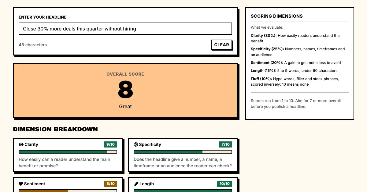
After: "Close 30% more deals this quarter without hiring"
The second headline has a timeframe and a number, and it implies transformation without using that word.
Do this now: Rewrite your headline using this formula: [Action] + [Specific Result] + [Timeframe]. Keep its promise the same as in the ad or email that sent the visitor, a principle called message match.
Mistake 4: Navigation distraction
Your landing page has a navigation bar. Every link in it is an escape route, and every escape route is a lost conversion.
Before: Full navigation bar with Home, Features, Pricing, Blog, About, Contact
After: Minimal header with only a CTA button and maybe a logo
Strip the header down so the visitor's attention stays on the page.
Do this now: Remove your navigation bar and test it for one week. Watch your form fill rate climb.
Mistake 5: Generic CTAs
"Submit" is not a button. "Get Started" is not compelling, and "Learn More" tells me nothing.
Before: "Submit" | "Learn More" | "Get Started"
After: "Get My Free Headlines" | "See How It Works" | "Punch My Copy"
They name a specific action, give the visitor a sense of ownership and make them curious.
Do this now: Change your CTA to something specific that describes the outcome instead of the action. Our free CTA generator suggests button copy sorted by what the click should do.
How do you fix all five landing page mistakes?
Work through them in this order:
- Replace features with problem statements
- Find one specific customer metric
- Rewrite your headline with a number and timeframe
- Kill the navigation bar
- Change your CTA to something specific
Run a 5-second test on the new headline, then test each change and measure its impact.
Sources
- Wikipedia: Landing page
- Nielsen Norman Group: How Long Do Users Stay on Web Pages?
- Wikipedia: Social proof
FAQ: Landing page mistakes
Q: Which mistake costs the most conversions?
A: The feature dump. A visitor who cannot see the benefit in the headline leaves before reading the features.
Q: Should a landing page have navigation at all?
A: A dedicated campaign page should not. A product page that doubles as a landing page can keep a minimal menu.
Q: How do I know which mistake my page makes?
A: Run the 5-second test on the headline and read the heat map for the CTA. The two tests cover four of the five mistakes.
What should you do now?
Punchd generates 20 headlines at once using conversion psychology. Each punch gives you options, and you pick the winners.